Kirks Folly Rebranding
Category: Branding
Duration: 1 month
2019
Project Description
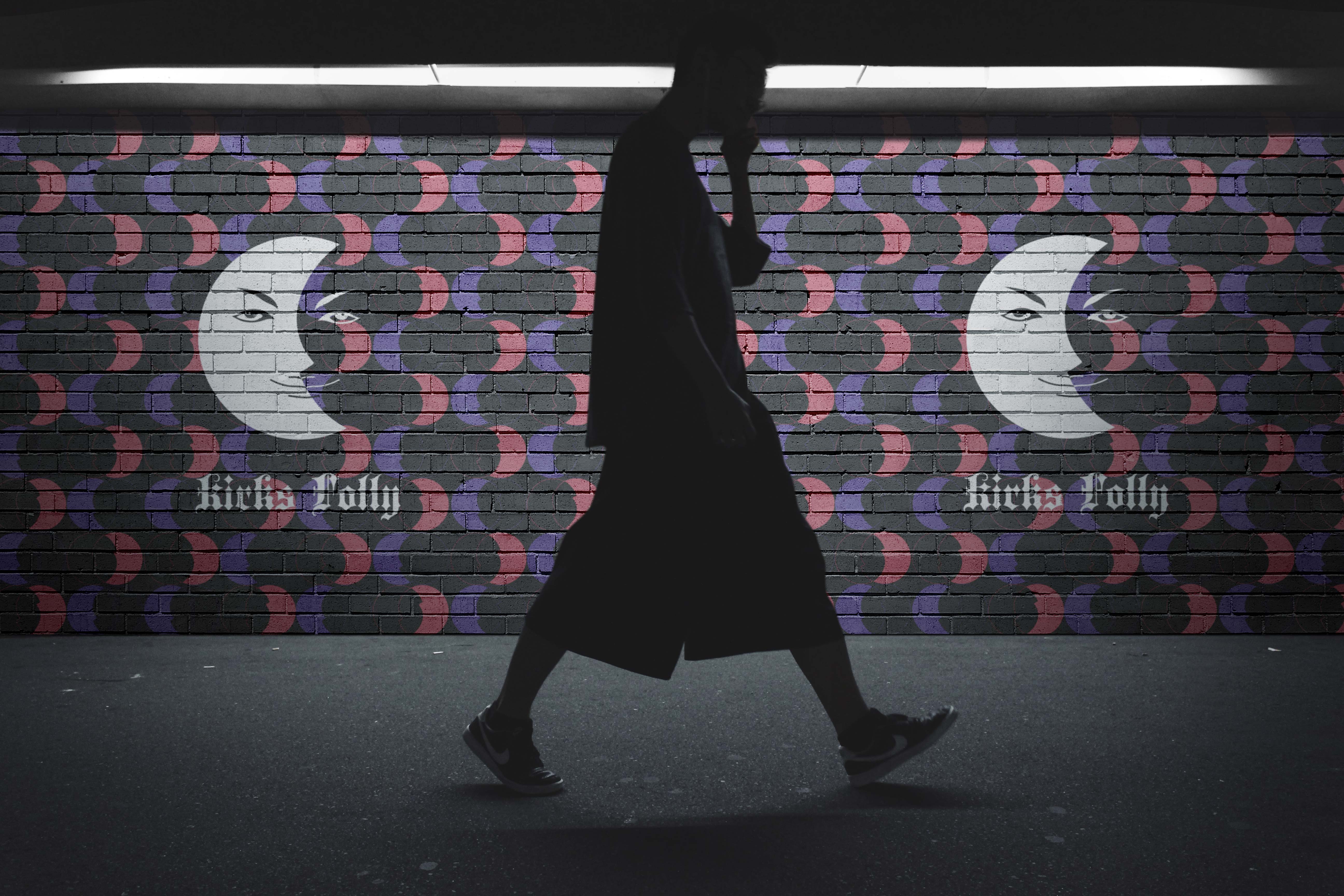
As a long-time fan of Kirks Folly, I embarked on a self-initiated rebranding project during my junior year of undergraduate studies in 2019. The goal was to refresh the brand’s identity while preserving its most beloved elements, particularly the iconic “moon face.”
While looking back, I can see that this project has some areas for improvement, it remains an important milestone in my design journey as it was my very first branding project.

About Kirks Folly
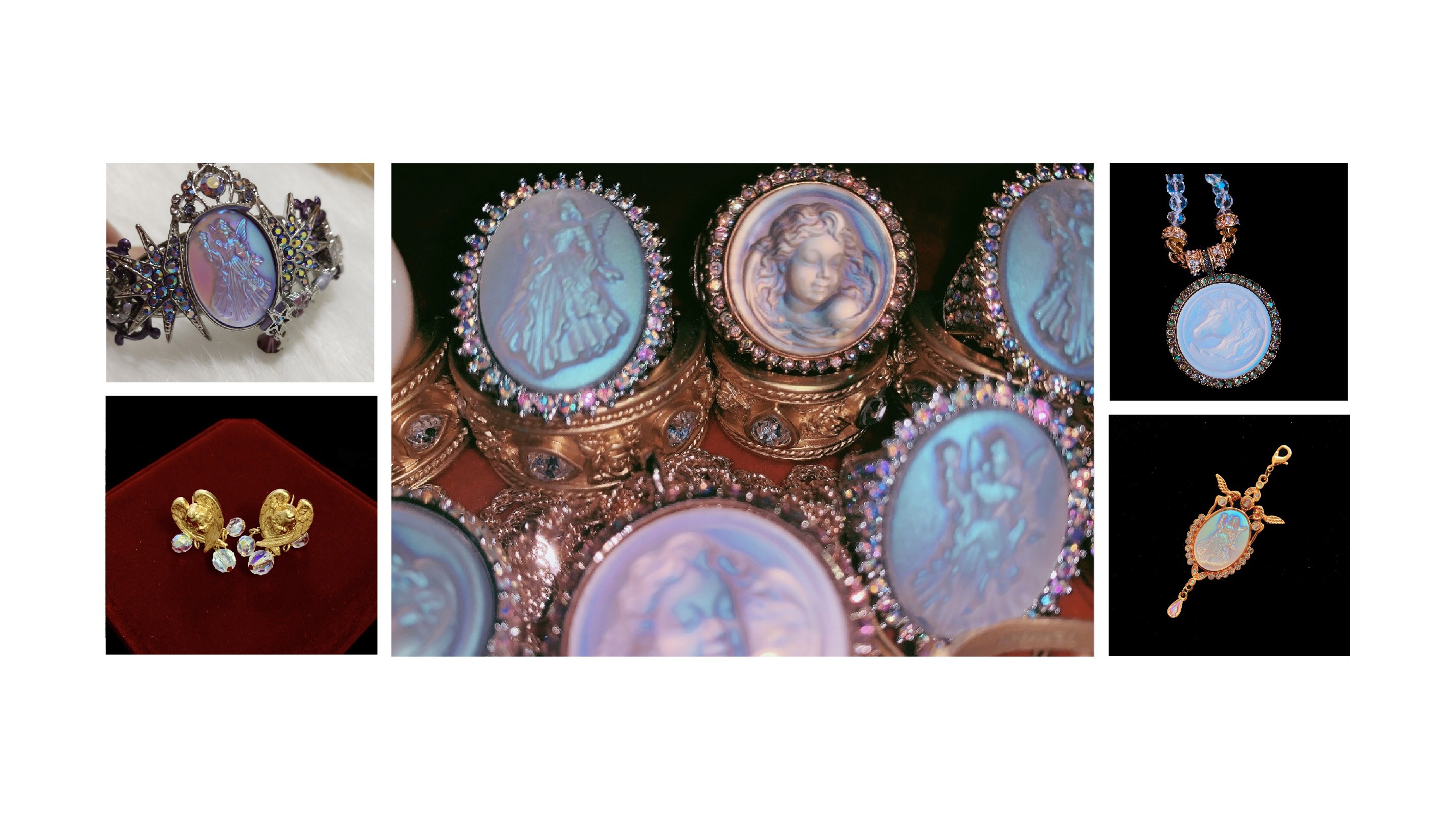
Kirk’s Folly is a beloved jewelry and accessories brand known for its whimsical, fantasy-inspired designs. Established in 1979 by Jennifer Kirk and her family, the brand quickly gained a devoted following with its enchanting collections that often feature celestial and magical themes, such as angels, fairies, and the iconic “moon face.” Kirks Folly pieces are meticulously crafted, often using high-quality alloys adorned with Austrian crystals and colorful rhinestones. Beyond jewelry, their product range includes decorative items like mirrors, jewelry boxes, and picture frames, all infused with the brand’s signature touch of fantasy. Kirk’s Folly has become synonymous with a sense of wonder and imagination, capturing the hearts of those who believe in the magic of dreams.
Logo
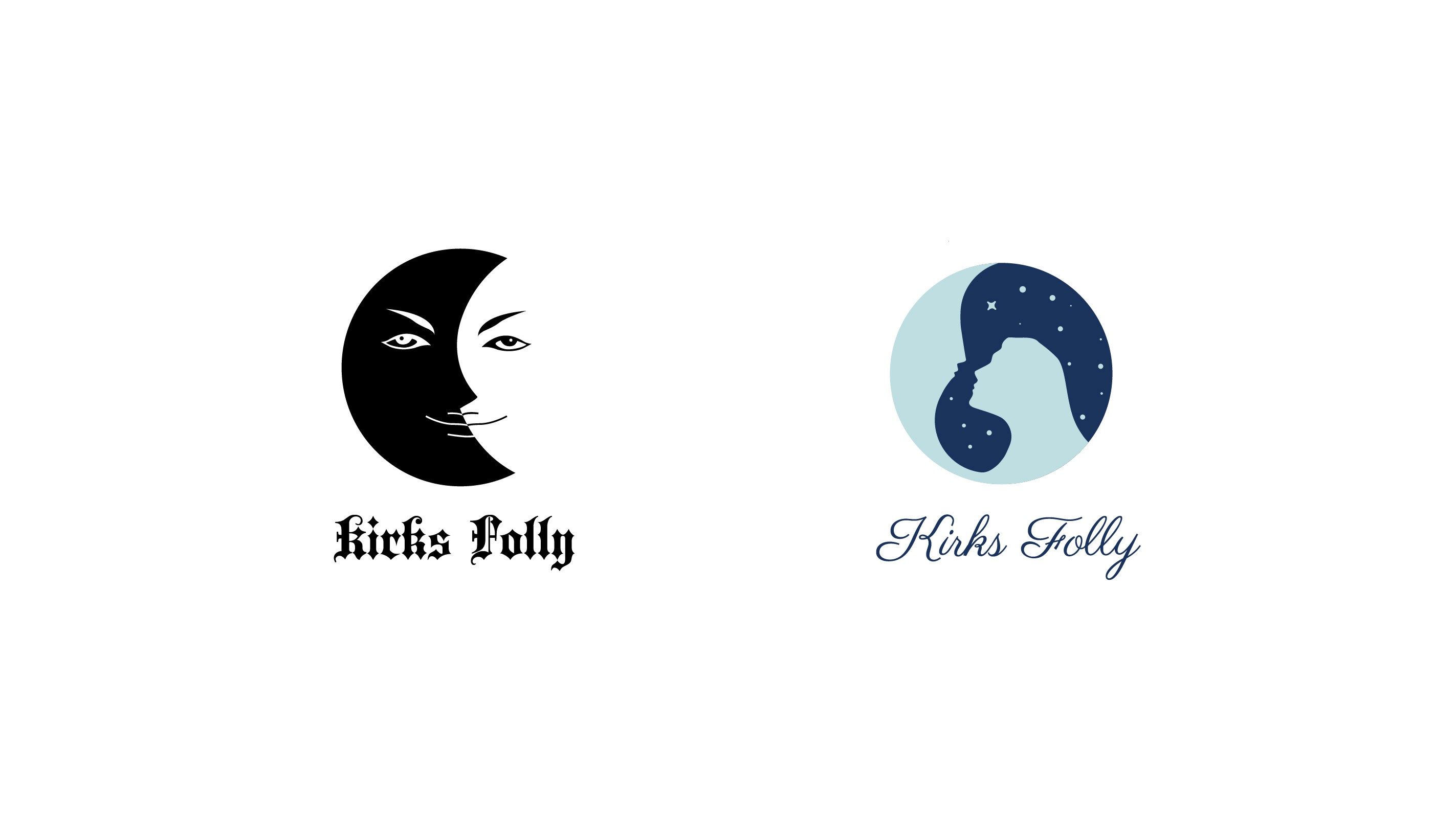
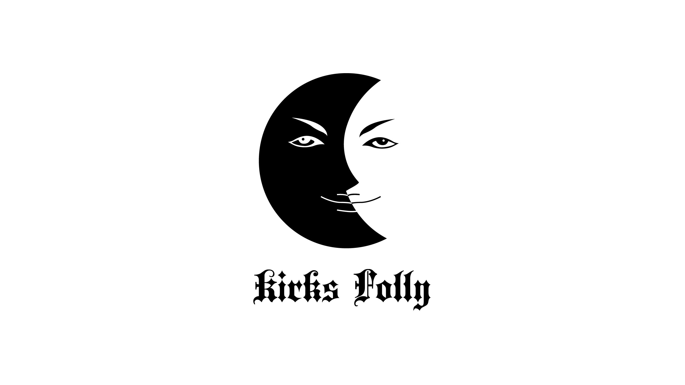
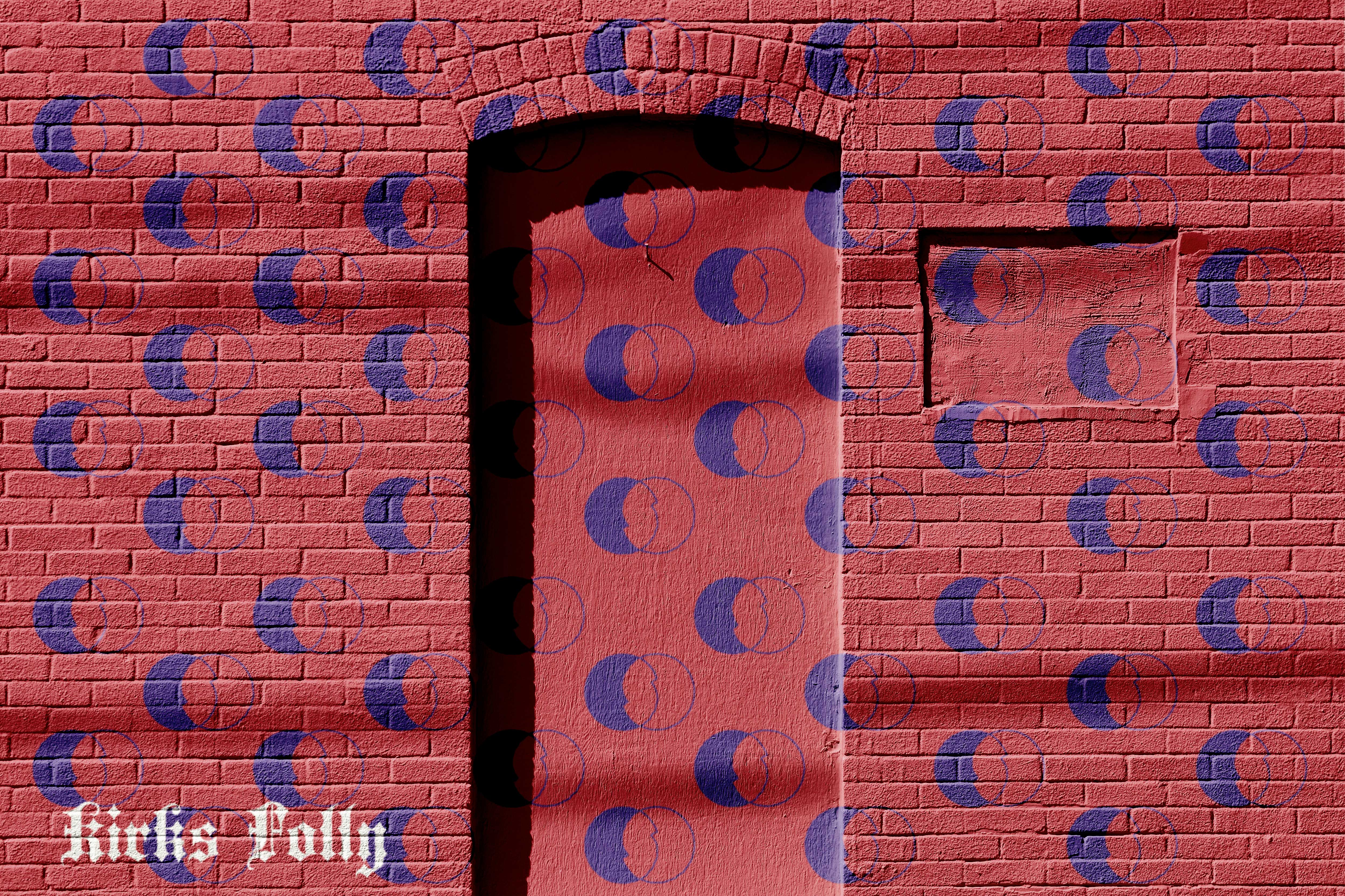
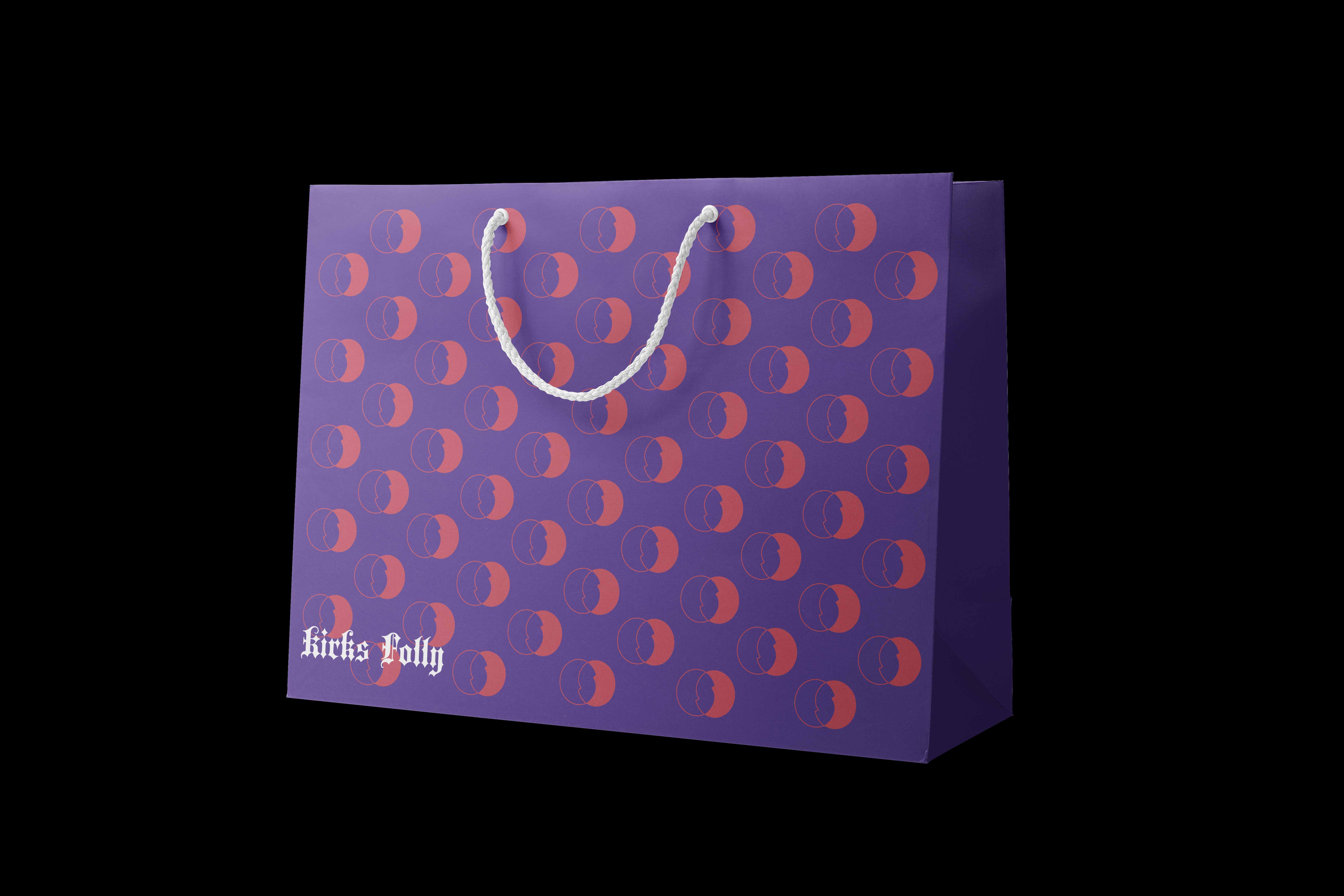
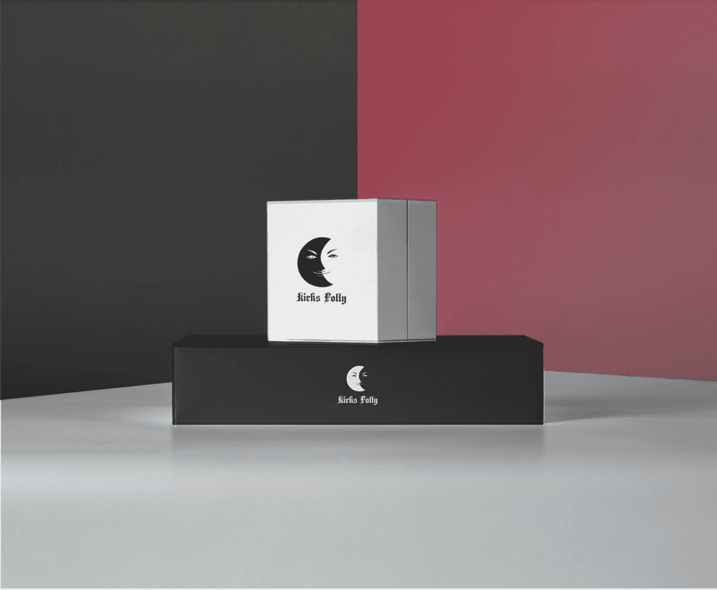
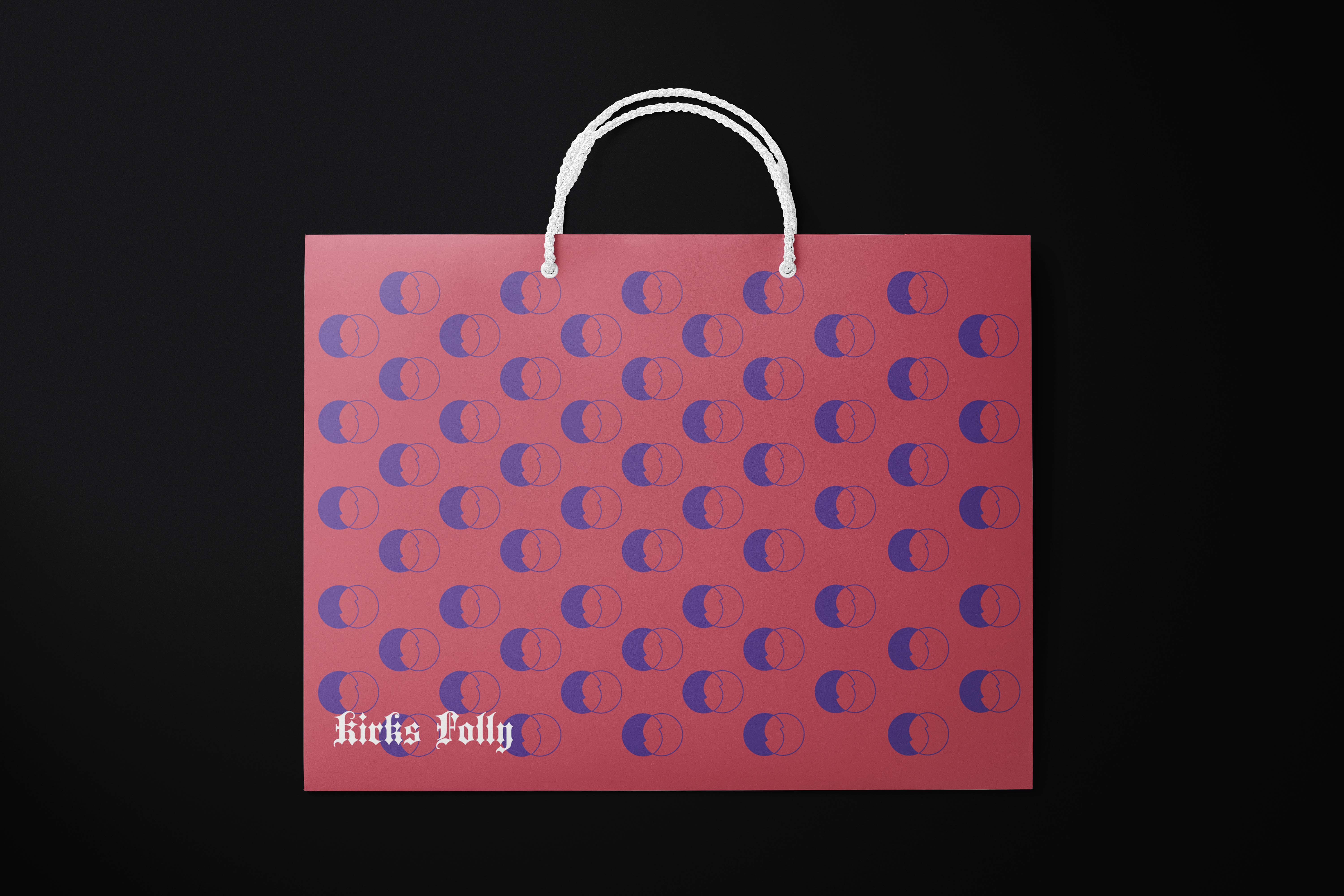
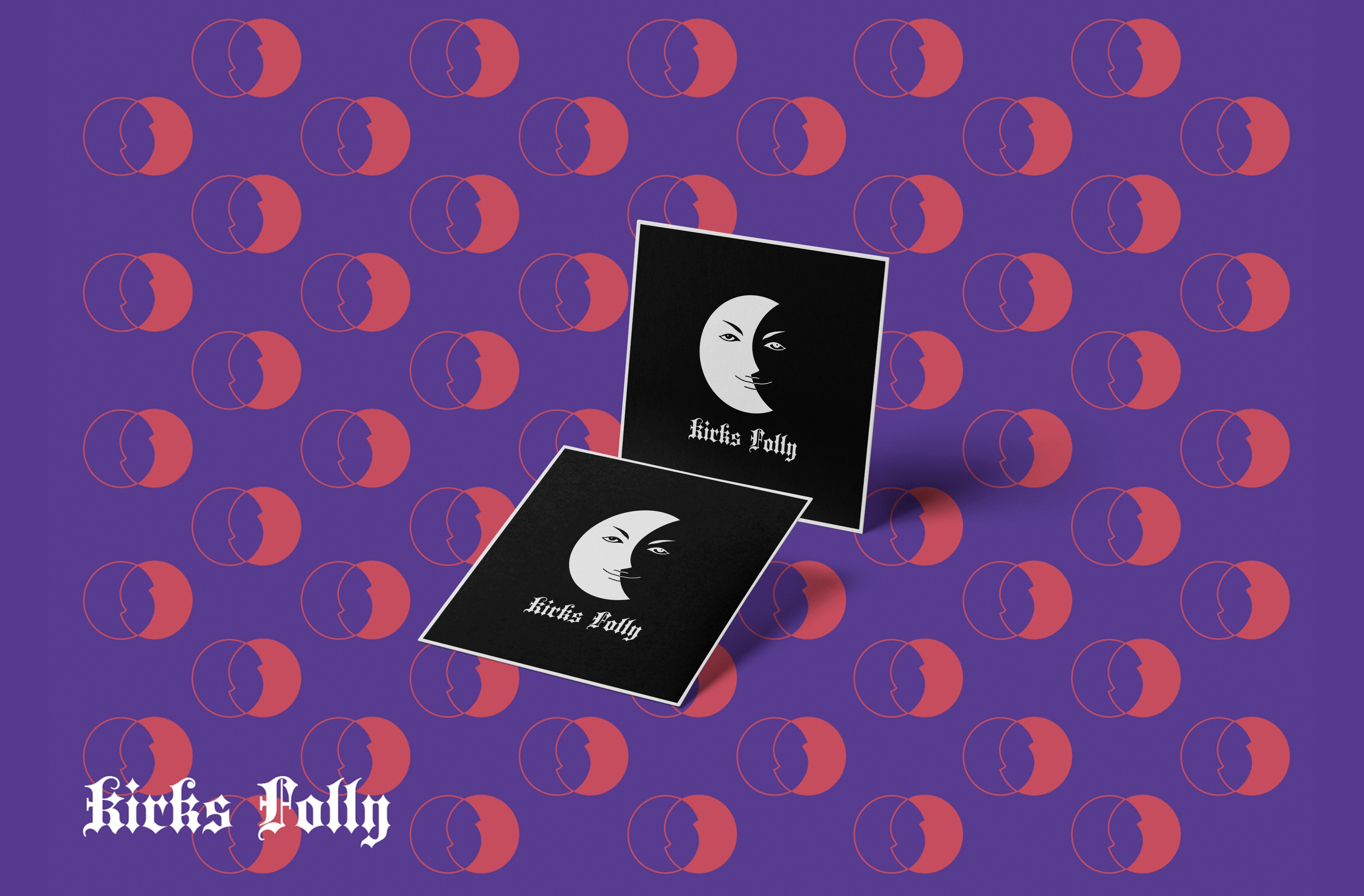
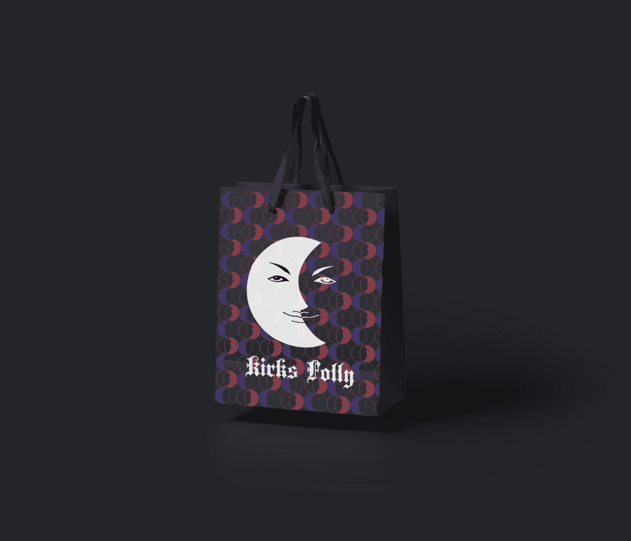
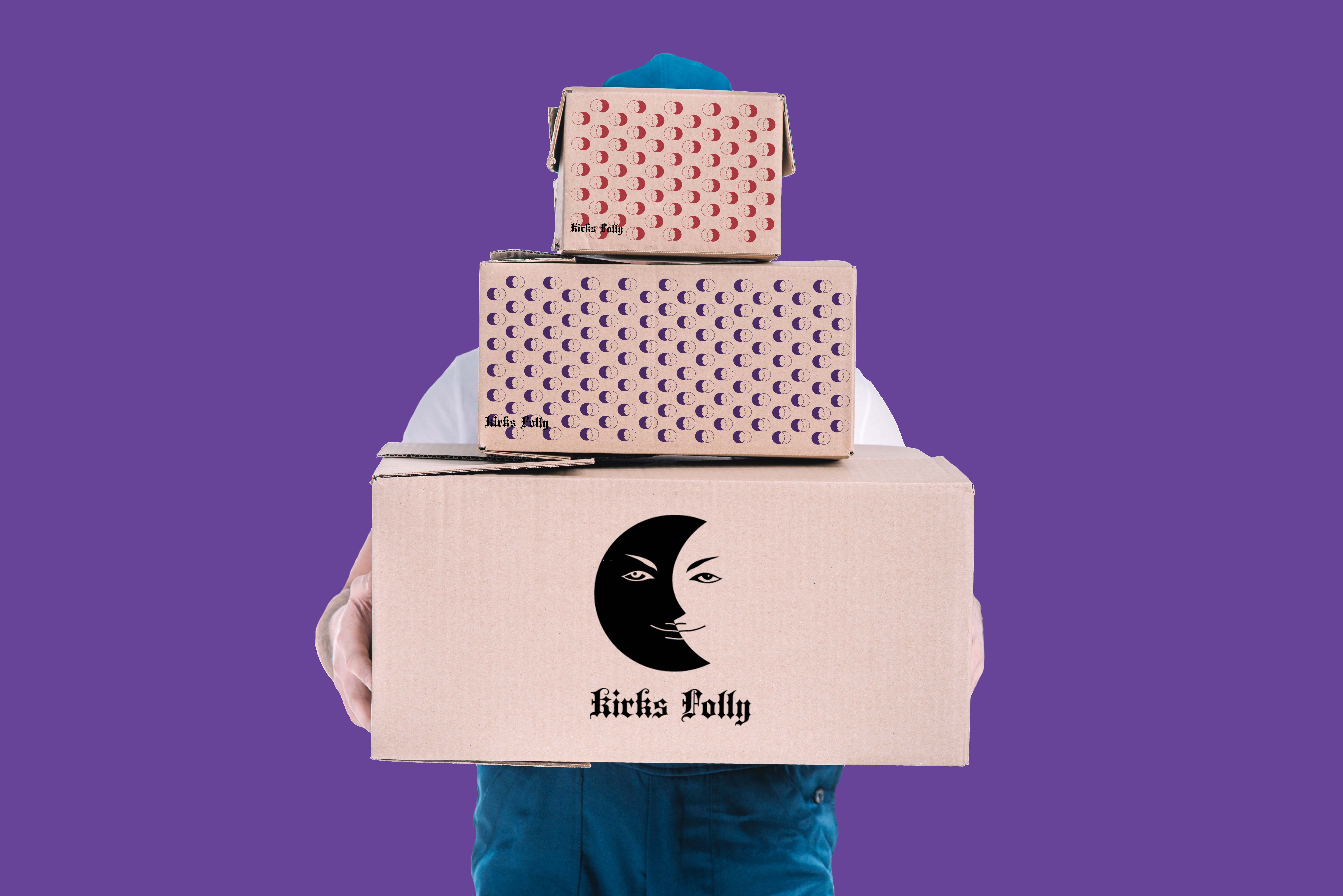
In the design process, I created two logo concepts. The first design, which I ultimately selected, features a bold black-and-white contrast that splits the moon face in half, symbolizing the interplay of light and darkness. This design captures the brand’s mysterious and whimsical essence. I chose a gothic-style font to further emphasize Kirk's Folly’s timeless and enchanting character.
The second concept took a softer approach with a palette of dark blue and pale blue, aiming to evoke a sense of tranquility and dreaminess. The simplified moon face, combined with starry elements, highlighted the brand’s fantastical nature. A handwritten font was used to convey warmth and approachability.
The final black-and-white logo strikes a balance between preserving Kirk's Folly’s unique charm and introducing modern elements to appeal to both loyal fans and new audiences.


Credits
Graphic Designer: Yucen Yao
Advisor : Cloris Chou

